
Sensor Sampling with React Recharts
Image was originally copied from pixabay
I recently used Recharts to visualize some sensor data with a React project. I had a great experience and wanted to share what I learned.
In this post I’ll walkthrough the project that I created, as well as how I gathered the data I used. If you want to see the source code for my project, check out my GitHub Repo. You can also view the end product of my project at https://peaceful-pare-b633fb.netlify.app.
I also created a YouTube video that covers this same project. Check it out at the following:

My Project
In our house, my office is located on the Southwest side of the house. During the colder months, this isn’t really an issue and all is ok. During the warmer months, my office quickly heats up as the Sun shines the most on that side of the house. Following “the sun rises in the east and sets in the west,” the normal sunrise and sunset patterns make it a target for heat. I also have several computers running, and when you combine the machine heat with the heat from the sun it can be unbearable.
To try to combat this last year, I bought multiple fans and literally opened the windows as well. While this didn’t fully solve the issue 100%, it did at least allow some airflow and make it bearable.
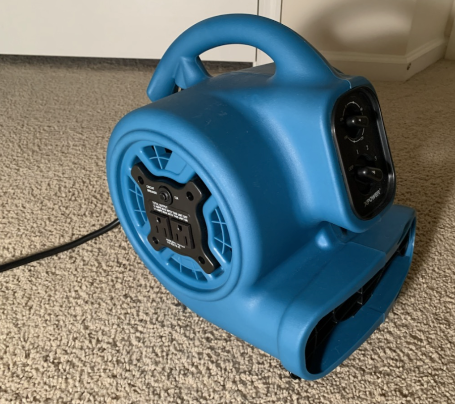
This year, I decided again to try and combat this issue. I bought an “air mover” fan that you normally see contractors using to dry out a wet carpet or fresh paint. The fan is pretty powerful and moves air at extreme rates. I thought this fan might make a bigger impact on the temperature situation.
I also reused a few smaller fans I had and tried to create the “hot aisle” and “cold aisle” server farm design I remembered from college.
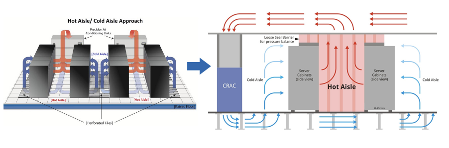
Image was copied from https://cool-shield.com/aisle-containment/.
To see if this was actually working, I wired up a DHT22 sensor to one of my Raspberry Pis. To monitor my experiment, I wired up a DHT22 sensor to one of my Raspberry Pis.
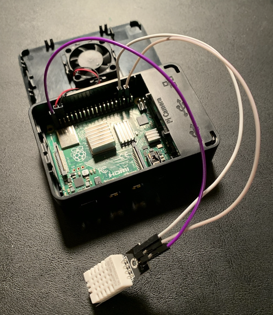
Normally I would walkthrough the steps of setting this up, but this post is more about Recharts. If you’d like to know how this works, I recommend checking out my posts Building a Weather Station with a Raspberry Pi and Firebase and Raspberry Pi Weather Lamp.
With the Raspberry Pi wired up, I wrote a small program to capture the temperature and humidity and then log that information on the Raspberry Pi. I then turned on a cron job so that it would do this once every minute. Here’s the Python program I used:
# this program was originally copied from the tutorial at
# https://learn.adafruit.com/dht-humidity-sensing-on-raspberry-pi-with-gdocs-logging/python-setup

import time
import board
import adafruit_dht
import logging

# Initial the dht device, with data pin connected to:
dhtDevice = adafruit_dht.DHT22(board.D20)

# logging
logging.basicConfig(filename='/home/pi/history_daily.log',format='%(asctime)s %(message)s', datefmt='%m/%d/%Y %I:%M:%S %p', level=logging.INFO)

try:
    # Print the values to the serial port
    temperature_c = dhtDevice.temperature
    temperature_f = temperature_c * (9 / 5) + 32
    humidity = dhtDevice.humidity
    output = "Temp: {:.1f} F / {:.1f} C    Humidity: {}% ".format(temperature_f, temperature_c, humidity)
    logging.info(output)
except Exception as error:
    logging.info("error occured")
    logging.info(error)
The program basically just records the temperature and humidity in a logfile. I turned this on and let it run as I ran my fans.
A few things that worked
After a few different attempts, what I found was that if I did run the fans throughout the day it seemed to keep the room cooler. However, it still was subject to heat, and spiked up almost 8 degrees everyday. Additionally, the “air mover” fan was incredibly loud. Even with noise canceling headphones, it felt like I was sitting inside an engine.
After testing for about two weeks, I considered all my options and realized it wasn’t that much work just to move my desk to an open area on the side of our living room. We have a small alcove that my desk fit nicely into, and after a few hours of moving the desk and hooking up the various computer cables I was good to go.
After doing all of this, I realized that I had collected a nice set of data that I could use with one of the visualization libraries. I reviewed several options and chose Recharts.
First though, I realized I needed to parse out a subset of the data since I had quite a bit recorded (values at 1 minute every minute for 2 weeks). I also realized I had to massage the data into a format (JSON) that would work with Recharts.
Mining the data
To start, the data was in a logfile (using the Python Loggging library). I also had started the experiment midday and ended midday so if I wanted to get a “holistic” sample of the data, I’d need to account for that. Finally, the DHT22 sensor that I used occasionally had errors, and I’d need to remove those to be able to get the data into a JSON format. I decided with JSON because it was easily parsable in a Frontend project.
First I wrote a Python program to parse the file and remove the incomplete days, as well as the errors. I also (after some trial and error) realized I wanted to limit the sample down to a smaller size so it didn’t take as long to load on a Frontend application. So here’s what I came to:
## reading files originally copied from stack abuse at
## https://stackabuse.com/writing-files-using-python/
## writing files originally copied from stack abuse at
## https://stackabuse.com/reading-files-with-python/

def writeOutput(line):
    appendFilehandle = open('clean_history.log','a')
    appendFilehandle.write(line)
    appendFilehandle.close()

# define the name of the file to read from
filename = "working_history_daily.log"

# open the file for reading
readFilehandle = open(filename, 'r')
while True:
    # read a single line
    line = readFilehandle.readline()
    if not line:
        break
    # cleanup file so clean 24 hour blocks have been recorded
    # limit to entries with 00 to limit data size so app will render well
    if("03/07/2021" not in line and "03/22/2021" not in line and "00" in line and "error" not in line and "Checksum" not in line and "DHT" not in line and "buffer" not in line):
        writeOutput(line)

# close the pointer to that file
readFilehandle.close()
So basically that program reads the original logfile, and then selectively writes the good records to the clean_history.log file.
With the file cleaned up, I wrote a second Python program that uses the python JSON encoder library to write out the results to JSON. I parsed the file and this is what I came up with:
import json

data = {"results": []}

# define the name of the file to read from
filename = "clean_history.log"

# open the file for reading
readFilehandle = open(filename, 'r')
while True:
    # read a single line
    line = readFilehandle.readline()
    if not line:
        break
    # 0          1        2  3     4    5 6 7    8    9         10
    # 03/21/2021 11:59:01 PM Temp: 71.2 F / 21.8 C    Humidity: 40.1%
    whitespaceArray = line.split()
    print(whitespaceArray)
    value = {
        'day': whitespaceArray[0],
        'time': whitespaceArray[1],
        'temp': whitespaceArray[4],
        'humidity': whitespaceArray[10].replace("%", "")
    }
    data["results"].append(value)

# close the pointer to that file
readFilehandle.close()

with open('TOTAL_RESULTS.json', 'w') as outfile:
    json.dump(data, outfile)
So that basically wrote out the values into a JSON file that I could then put into a Frontend project. If you notice I even counted out each line of the file so that I knew where the split function put the values. I then could use that to figure out how to build each item in my JSON file.
Onto the frontend!
So now I had my dataset and wanted to put it together with a line chart. I did some Googling and decided on Recharts. They have some great docs, and after playing with one of their samples I was able to pretty much all I needed to. A few things I thought were really cool right away:
- Their docs were very helpful (even including live examples)
- I created a react app with
create-react-appbut found that I had to downgrade my version to use React 16 after reviewing this GitHub issue. - The line graph that was generated was interactive, so (with your mouse) you could follow the data across the graph
- When the graph first is rendered it has a really nice loading animation
- All of this I was able to figure out in the course of a few hours playing with my data and React
I built a basic little React project and made a component that followed the Recharts docs for Line Charts. I ended up having a component that looked like this:

The component itself is fairly simple and looks like this:
import React, { useState, useEffect } from "react";
import {
  LineChart,
  Line,
  XAxis,
  YAxis,
  CartesianGrid,
  Tooltip,
  Legend,
} from "recharts";
import TotalResults from "../results/TOTAL_RESULTS";
import "../App.css";

export default function Total() {
  const totalResults = TotalResults.results;

  const [results, setResults] = useState([]);

  useEffect(() => {
    const formattedResults = [];
    totalResults.forEach((value) => {
      console.log("reading value");
      formattedResults.push({
        day: value.day,
        time: value.time,
        temp: parseFloat(value.temp),
        humidity: parseFloat(value.humidity),
      });
    });
    setResults(formattedResults);
  }, [totalResults]);

  return (
    <div className="wrapper">
      <LineChart
        width={1000}
        height={500}
        data={results}
        margin={{
          top: 5,
          right: 30,
          left: 20,
          bottom: 5,
        }}
      >
        <CartesianGrid strokeDasharray="3 3" />
        <XAxis interval={50} dataKey="day" />
        <YAxis domain={[20, 80]} />
        <Tooltip />
        <Legend verticalAlign="bottom" height={1} />
        <Line
          type="monotone"
          dataKey="temp"
          stroke="#8884d8"
          activeDot={{ r: 8 }}
        />
        <Line type="monotone" dataKey="humidity" stroke="#82ca9d" />
      </LineChart>
    </div>
  );
}
If you notice, I basically just used the <LineChart> component and passed in the props for the data and some basic styling. This was all really intuitive (and fun).
Further Mining
I was really happy with my little graph so far, but I thought it’d be cool to see the data compared with the actual weather of that day. The data that I was using were readings that came from the sensor in my office. It’d be cool to see how the sensor readings correlated to the exterior weather conditions.
I went back to my Python and refactored my original programs to parse out a specific day. I decided on 03/18/2021 and rewrote my original Python program to look like the following:
## write files originally copied from stack abuse at
## https://stackabuse.com/writing-files-using-python/

## read files originally copied from stack abuse at
## https://stackabuse.com/reading-files-with-python/

def writeOutput(line):
    appendFilehandle = open('clean_history.log','a')
    appendFilehandle.write(line)
    appendFilehandle.close()

# define the name of the file to read from
filename = "working_history_daily.log"

# open the file for reading
readFilehandle = open(filename, 'r')
while True:
    # read a single line
    line = readFilehandle.readline()
    if not line:
        break
    # # cleanup file so clean 24 hour blocks have been recorded
    if("03/18/2021" in line and "00" in line and "error" not in line and "Checksum" not in line and "DHT" not in line and "buffer" not in line):
        writeOutput(line)

# close the pointer to that file
readFilehandle.close()
Then I did the same for the Python program that created my JSON file, and the end result looked like this:
import json
data = {"results": []}
# define the name of the file to read from
filename = "clean_history.log"
# open the file for reading
readFilehandle = open(filename, 'r')
while True:
# read a single line
line = readFilehandle.readline()
if not line:
break
# 0 1 2 3 4 5 6 7 8 9 10
# 03/21/2021 11:59:01 PM Temp: 71.2 F / 21.8 C Humidity: 40.1%
whitespaceArray = line.split()
print(whitespaceArray)
value = {
'day': whitespaceArray[0],
'time': " ".join([whitespaceArray[1], whitespaceArray[2]]),
'temp': whitespaceArray[4],
'humidity': whitespaceArray[10].replace("%", "")
}
data["results"].append(value)
# close the pointer to that file
readFilehandle.close()
with open('SINGLE_RESULTS.json', 'w') as outfile:
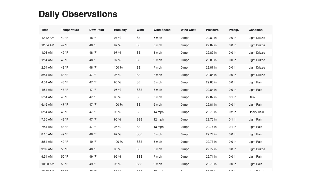
json.dump(data, outfile)So I now had readings for a specific day, but also needed the exterior weather conditions for that same day. After some googling I found that WeatherUnderground has historical data in a nice table that I could copy into my project. I got information about Richmond’s Weather from WeatherUnderground’s Daily History Site.
I took that information and put into a google sheet, and then I exported it as a CSV. Then I took the CSV and used this CSV to JSON converter to create the JSON array I needed for my project.
Then I built a second page on my React App that had just the readings for 03/18/2021 and the actual temperature and humidity readings alongside them:
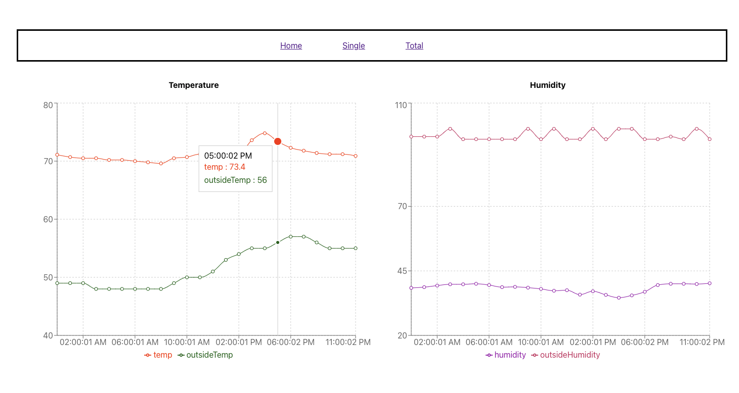
Again, same things I was blown away with before:
- Recharts is super simple to use
- I could see my data in a live and interactive manner
- The Recharts API was easy to understand and customize for the styles and colors I wanted
- This whole project was a lot of fun!
From there, I hooked up my project to Netlify and hosted the project at https://peaceful-pare-b633fb.netlify.app
Closing Thoughts
So that was it, my small set of experiments turned into a fun review of Recharts and I even got to do some Python along the way.
I haven’t really had a chance to look into the other charting abilities of Recharts, but from everything I’ve googled it seems to all be super user friendly. Next time I need to create some data visualization I’ll definitely refer back to them.
The other thing I learned was that unless you want to rebuild your HVAC (which could be a viable option) there are some challenges that fans won’t overcome. For now I’m happy with my relocated desk, and enjoying my spot for the Springtime.